Tabatwo is a startup building a fitness app for iOS and Android, for training with friends. The app had live classes, custom workouts, instructor bookings and a social feed, and the team needed to decide which of those mattered most. I tested the app with users to help them choose.
Client
Tabatwo
Platform
iOS and Android app
Role
UX Consultant
Timeline
Oct–Dec 2025
Focus
Discovery · Testing · Prioritisation
At a glance
The problem
Lots of features and no clear centre. After onboarding, people couldn't say what the app was for. Booking took too many steps, and the social features, the whole point of the brand, were tucked away.
What I did
Mapped the journeys that mattered most, ran five moderated think-aloud sessions across eight areas of the app, then ranked what we found by impact, frequency and risk to trust.
What changed
A short, ranked backlog, success criteria everyone agreed on, and a clear direction for the team at an important point in the build.
“She ran comprehensive user testing, identified actionable improvements, and worked collaboratively with our development team to ensure designs were technically feasible. Andrea also helped us clarify fundamental product concepts that became central to our platform's direction.”
What we put in front of people
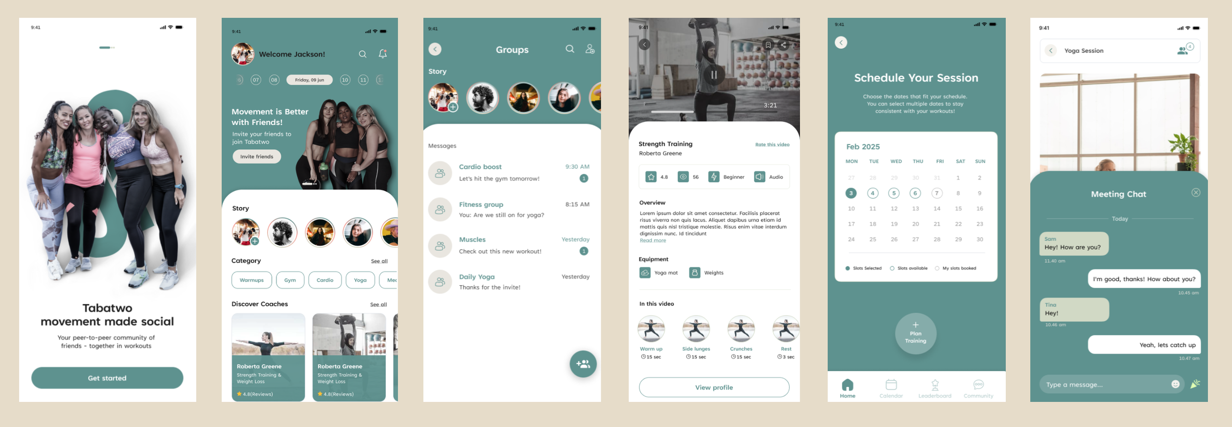
Six of the screens people worked through: onboarding, home, groups messaging, a strength training video, session scheduling and in-session chat.
How the work ran
FrameThe brief was “improve the app”. First I sat down with the founders and wrote one sentence about what Tabatwo is for: training with people you know, easily. We used that sentence to decide priorities later on.
MapI mapped the journeys that mattered most: onboarding, booking an instructor and starting a workout. This showed problems early: three overlapping ways to book and two ways to search.
TestFive moderated think-aloud sessions of 60 to 90 minutes, with people aged 21 to 68, across eight areas of the app.
RankI grouped the findings into themes and ranked them by impact, how often they came up, and risk to trust. The team got a short list of what to fix first.
Hand overWe agreed what “fixed” would look like: understand the app in 30 seconds, book in under three taps. The handover was a working session with product and engineering.
What testing found
Onboarding
High impact
What we saw
Payment details were requested before users understood what the app offers
Confusion between “fitness level” and “activity level”
Concerns about being asked age, weight and gender
OTP took longer than ten seconds
Recommended
Collect only what you will use, and later
Reorder the goals; move “Skip” to the top right
Explain why each question is asked
Home screen
High impact
What we saw
No clear call to action, and no personalised content
Users wanted a guiding hand on first open
Recommended
Decide the single main CTA
Add a “Let’s get started” prompt for first-time users
Rename “Bookmarks” to “Saved”
Custom session
High impact
What we saw
Only one of five users managed to play a saved session
Users had to calculate session length themselves
Too little distinction between work and rest screens
Playback issues caused real demotivation
Recommended
Add a play button for saved sessions
Audio guidance and a beginner overview up front
Clear visual difference between active and rest
Payment
High impact
What we saw
Unclear what was free and what was paid
Uncertainty over whether invited friends pay too
The Apple payment disclaimer read as untrustworthy
Recommended
State up front that the app is free unless booking an instructor
Move payment details to profile settings
Friends & community
High impact
What we saw
“My friends” and “Community” overlapped
No way to preview a profile before adding
Posting felt like a less intuitive Instagram; messaging was preferred
Recommended
Invite a friend during booking, not after
Reconsider feed-style sharing versus group chats
Let instructors be followed
Navigation
Medium
What we saw
Back button sometimes returned home, risking lost progress
Search was hard to find
“+” sat where the profile icon was expected
Recommended
One consistent position for search and profile
Unified search defaulting to “All”
Review the main menu
Booking an instructor
Medium
What we saw
All five booked successfully, but “Book this instructor” sat at the very bottom
“Book slot”, “request slot” and “custom request” were confused
Friends could only be invited after booking
Recommended
Move “Book now” to the top
Three steps or fewer
Invite friends earlier in the flow
Calendar
Medium
What we saw
Time scrolling moved minute by minute
No week view
Weeks starting on Sunday caused friction
Recommended
Scroll in fifteen-minute intervals
Add a month/week toggle
How it was ranked
High impactMedium
Each area plotted by how much it hurt trust, motivation or revenue, and how many of the five people ran into it. The shaded corner became the backlog, in that order.
What to fix first
01
Decide what the app is for
Instructors, or friends and online workouts? Pick one and make that flow great. Until that was decided, other decisions were hard to make.
02
Guide the first two minutes
Confusion in onboarding cost trust and motivation before the app had a chance to show what it does.
03
Book in three taps
Book, pick a time, confirm. Put “Book now” at the top, and let people invite friends earlier.
04
Put friends at the centre
Training with friends is the heart of the brand, and it was the most hidden part of the app.