The problem
Functionality had accumulated piecemeal, section by section, for four years. Start-ups and growing businesses were served the same undifferentiated site, and neither found what they came for.
Case study · Business Gateway
Four years of features added section by section, never across the platform. The redevelopment separated the two audiences the site had been trying to serve at once, and gave each of them a path.
If you read nothing else · 40 seconds
Functionality had accumulated piecemeal, section by section, for four years. Start-ups and growing businesses were served the same undifferentiated site, and neither found what they came for.
Lean and agile: research into a structural argument, co-creation workshops, wireframes before visual design, then two UX, two design and four development sprints.
An architecture that separates start-up from growth, a tool that tailors content to your stage, sector and place, and a WAI ‘A’ rating.
The site had performed well for four years. That was the problem. New functionality and content had been added steadily and successfully, but always into individual areas — never across the platform. Each addition made sense on its own and the whole made steadily less sense together.
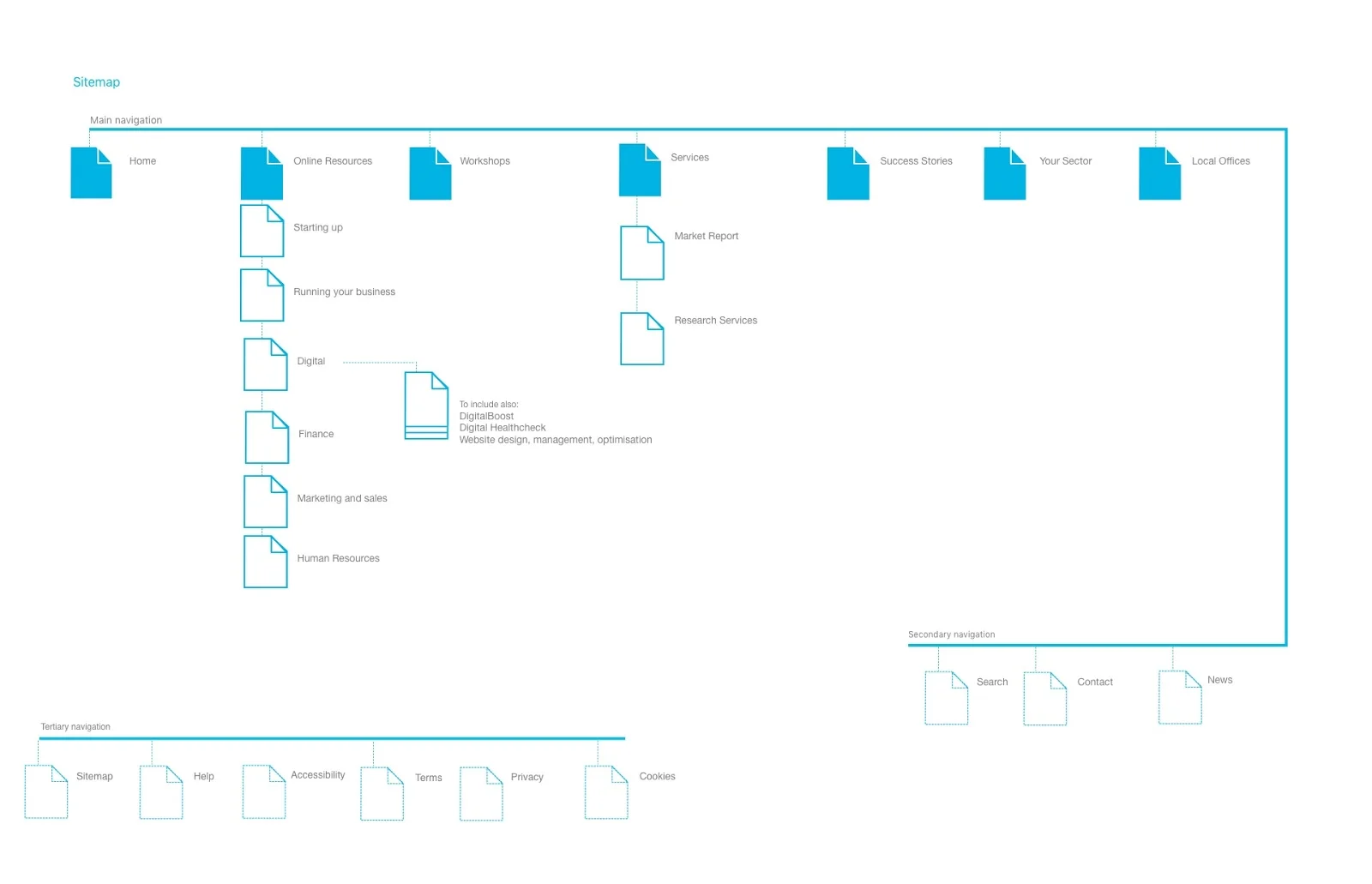
What was left was a structure that had grown rather than been designed: two very different audiences moving through one undifferentiated site, help sitting behind gates, and local offices running as separate micro-sites outside the thing they belonged to. Adding one more section would not have fixed it.
Four areas · open one to read the detail
The structural decision the rest depended on
Homepage · paper first, then pixels
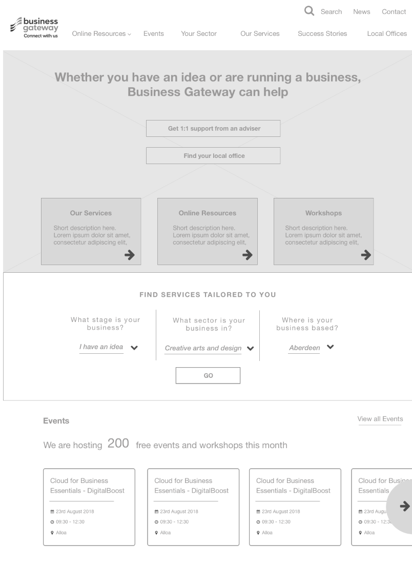
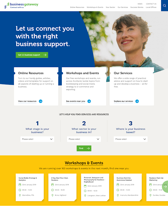
Three questions, then only what applies to you
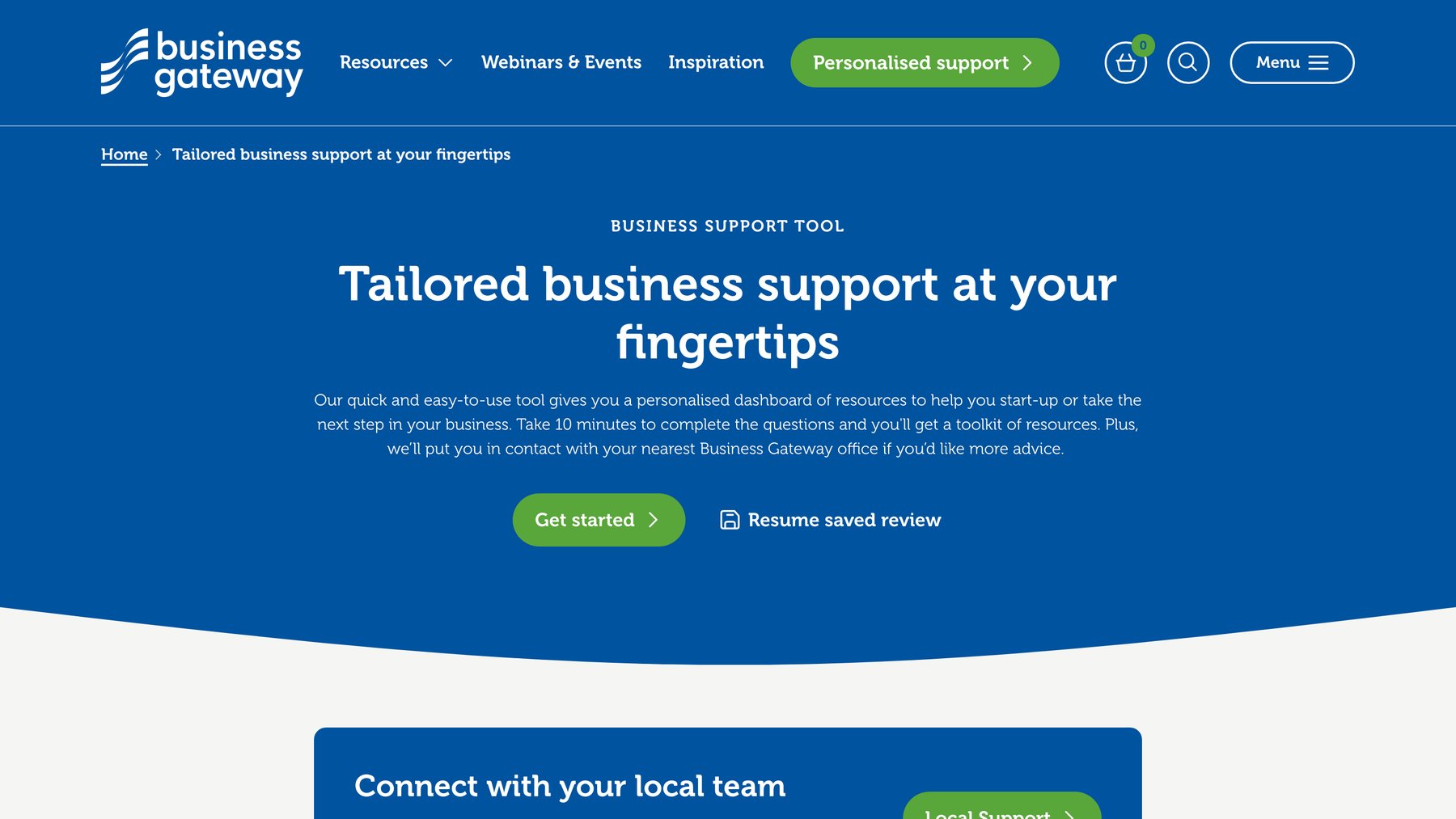
The audience research kept returning the same two things: people were time-poor, and they wanted content that already knew something about them. A tool that asks three optional questions — what stage your business is at, what sector it is in, where you are based — and returns only the resources, events and reports that match was the most direct answer to both.
I kept it short, optional and in plain language. It is the piece of the project I would point at first: the research said time-poor, and the tool is what time-poor looks like when you design for it.
Select a step
Four years of additions had been made section by section, never across the platform. The review made the pattern legible: the site was serving a start-up and a growing business the same undifferentiated experience, and neither was finding what they came for.
Measured against the previous site
Across all devices, pages per session rose from 3.81 to 4.05. The site was delivered to a WAI ‘A’ rating, with passes against many AA and AAA criteria.
We worked at pace and co-created with the client, and the budget left very little room for formal user testing. Not being able to validate with real users feels like fumbling in the dark, and I would rather iterate against evidence than against consensus.
What made it work anyway was that we were not designing in silo: the client held a great deal of user insight, and that sat on top of the UX review and the audience research already done. The performance numbers bear that out. But co-creation is a substitute for testing, not an equivalent, and I would fight harder for the testing budget now.
The other unfinished piece is accessibility. WAI ‘A’ with many AA and AAA passes is a good place to launch from and the wrong place to stop. Reducing the number of PDFs and closing the gap to full AA compliance was the work I wanted to carry into the next phase.
“I've been working with Whitespace on a wide range of projects for over 7 years. Their work and final products for DigitalBoost have always been incredibly useful and engaging. They feel like part of the team.”