The problem
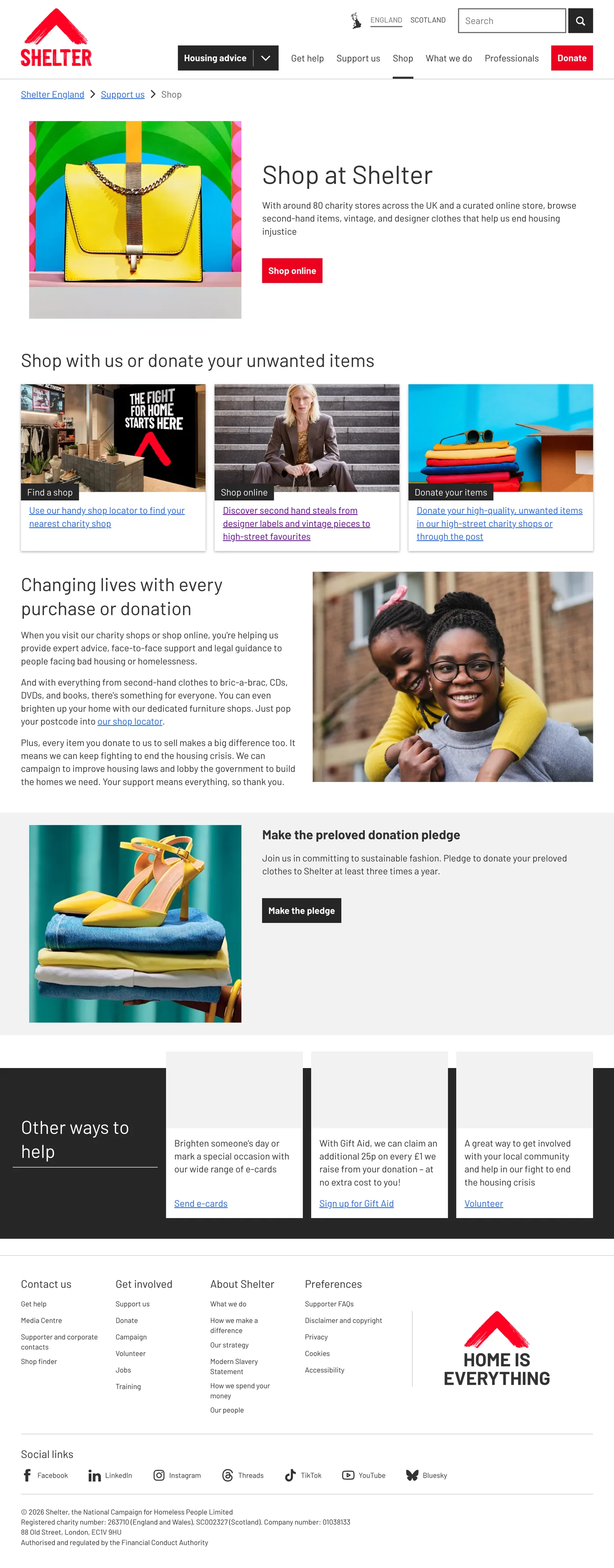
The shops were closed and there was stock to sell before Christmas. But in testing, half of the people couldn't find the online shop from Shelter's website.
Case study · Shelter
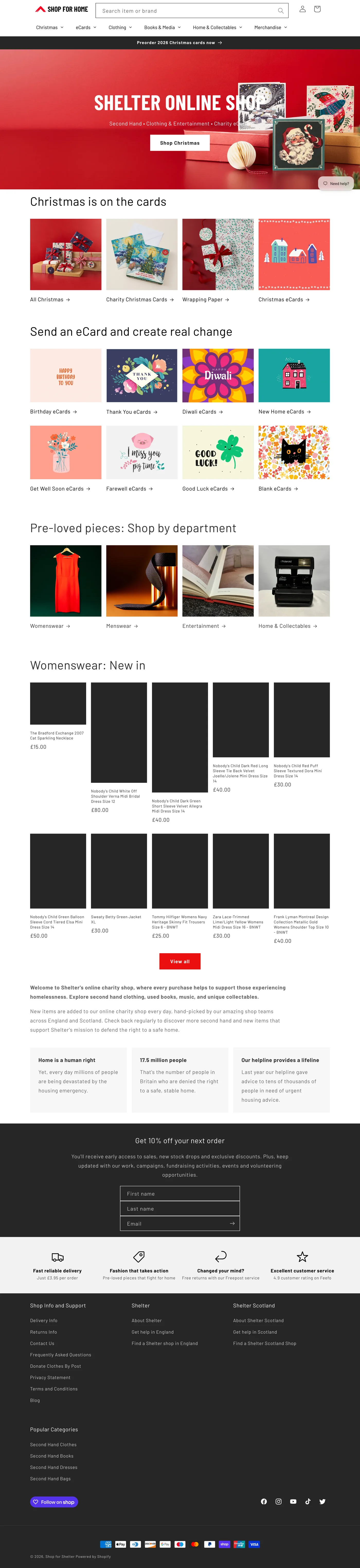
In winter 2020 Shelter's charity shops were closed because of the pandemic, so the online shop needed to bring in more money. I worked with the Income Generation team for four months, first on the Christmas card shop and then on the new second-hand clothing shop.
The shops were closed and there was stock to sell before Christmas. But in testing, half of the people couldn't find the online shop from Shelter's website.
Looked at the analytics for quick changes before Christmas, reviewed the new second-hand shop, and ran research with shop managers, staff and members of the public.
“Shop” was added to Shelter's main navigation, as the research recommended. The online shop now brings in additional income for Shelter.
The online shop had a lot of stock that the stakeholders needed to promote heavily in the run up to Christmas. This was partly to help plug the gap caused by the closure of physical shops, and partly because some of the stock would be out of date once the new brand came in.
I went through the analytics and site search data to find changes we could make quickly.
We swapped them for cards that were in stock. Longer term, sold-out cards should move to the end of the list automatically.
Most volunteering was paused because of the pandemic, so this was a dead end. I suggested swapping the Volunteer and Online shop cards for now.
“e card” worked, but “ecards” didn't. I suggested fixing these searches, and showing the online shop first for searches like “Christmas gifts”.
People donating were also looking for cards, so I suggested linking to the shop from those pages without distracting from donating.
Shelter had just launched a second-hand clothing shop online. Before testing it with people, I reviewed it myself so I knew what to look out for.
The menu said “Second-hand Store”, but the page and breadcrumb said “Reuse, Restore, Rehome”. Neither mentioned clothes.
The filter list grew every time a product was added, and the page numbers were hidden, so browsing was hard.
The Shelter logo linked to the main website, not the shop homepage, so it was easy to lose your way.
You could add more than one of a one-off item. On mobile, the 50% off banner covered the menu and the basket.
As Shelter had recently launched the second-hand shop, we wanted to broaden our understanding of how users interact with it. Our main objective was to uncover current pain points and highlight potential areas for improvement.
“Just because they are selling second-hand goods doesn’t mean the website has to be second-hand.”
“I don’t think I understand what condition the clothes are in.”
“Customers are looking for a bargain.”
Buys second-hand because it is better for the environment. Cares about which brands are sold, how long things last and how far they are shipped.
What would helpMore sustainable packaging.
Wants a good deal. Items need to be cheaper than buying them new on the high street.
What would helpShowing price reductions, and explaining that the mailing list gives discount codes.
Looks for designer labels at lower prices, and for vintage and one-off pieces.
What would helpA separate section for designer items, instead of one long list of brands.
We asked people to rank brand, colour, material, price, size, condition and style. Condition was consistently ranked highly, while the others varied.
Shop managers received anywhere from 300 to 500 boxes a week, with little space to sort, photograph or store them. Putting items on Shopify took a long time, and they typed details like condition, tax and the environmental message by hand every time. The shop needed to be easier for them to run, as well as easier to shop from.
“Shop” is now in the main navigation of england.shelter.org.uk, and the online shop brings in additional income for Shelter. Scroll inside the frames to see the full pages.