The problem
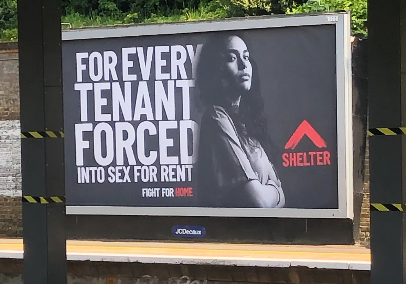
The new brand was a red brushstroke, designed for posters and campaigns. It had to work on a website people read on their phones, often when they are stressed. And the red couldn't be used for everything.
Case study · Shelter
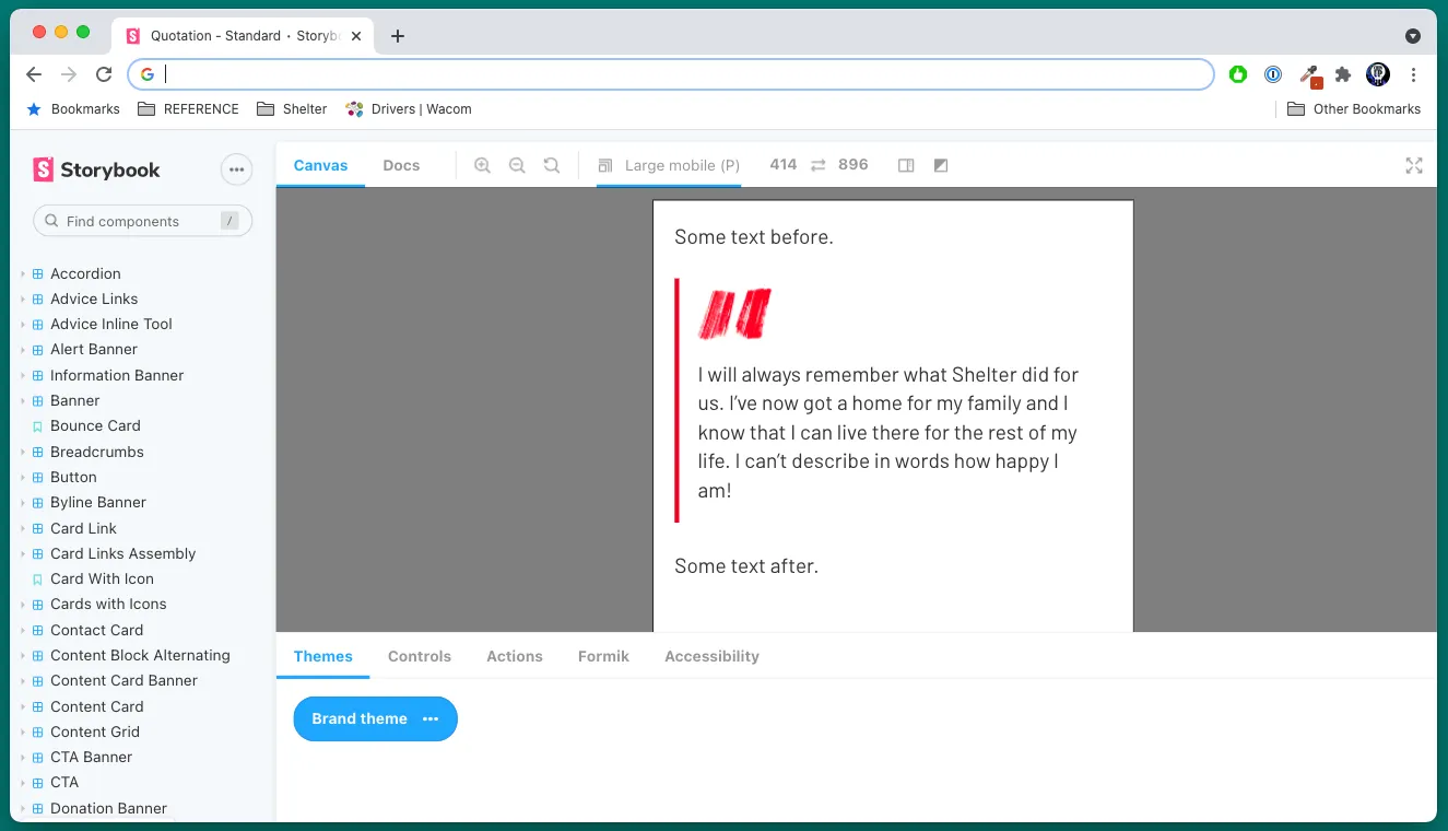
Shelter introduced a new brand, built around a red brushstroke. As Senior UX Designer, I turned it into a design system for the website, while making sure the housing advice stayed easy to read.
The new brand was a red brushstroke, designed for posters and campaigns. It had to work on a website people read on their phones, often when they are stressed. And the red couldn't be used for everything.
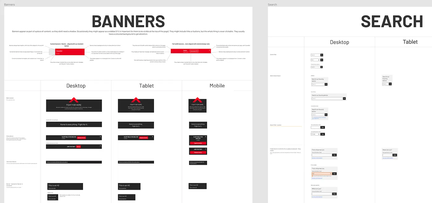
Added extra colours for digital, gave every colour a name and a use, wrote component specs for three screen sizes, and built the brand as a theme in Storybook for developers.
The new brand launched on the design system. Years later, england.shelter.org.uk is still built on it.
“She was an invaluable mentor, teaching me a great deal and helping me significantly enhance my design skills.”

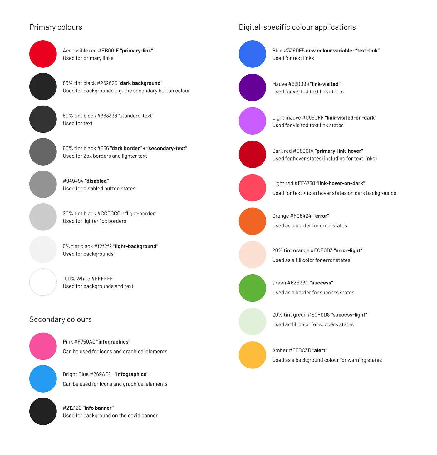
The brand was built on one strong red. That works on a poster. On a website the colour also has to show what you can click and which pages you have visited, and text has to be easy to read on a small screen.
One red couldn't do all of that and still meet accessibility contrast requirements. So I made the case for extra colours just for digital. We used a version of the red that passes AA for buttons and main links, and gave text links their own blue, with colours for hover and visited links.
That meant convincing the brand and marketing team.
primary-link4.61 : 1 AAPrimary actions and emphasis. Kept away from long reading.
text-link4.52 : 1 AANew for digital. Text links, so red didn't have to be a link too.
link-visited10.37 : 1 AAAVisited links, so people can see which advice they've already read.
primary-link-hover6.05 : 1 AAHover states, including text links.
Contrast measured against white. Colours from the palette I handed over.
For example primary-link, text-link, standard-text, error and disabled. This meant designers and developers didn't have to decide colours page by page.
Error, success and alert messages each got a border colour and a light background colour. Disabled buttons got one grey.
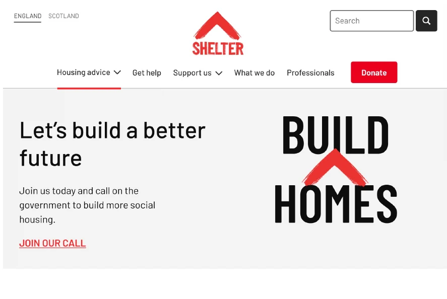
The new brand used a lot of capital letters, and stakeholders were hoping to use them on the website too. Using uppercase letters can make the user feel like YOU ARE SHOUTING AT THEM, so I looked at the research before we designed anything.
All-caps has been shown to increase stress levels and cognitive load, make reading slower and make text harder to scan. Screen readers can read out words typed in capitals letter by letter. And we needed to keep in mind that whilst we wanted to express a louder voice through protesting, Shelter’s website is primarily a support service.
Main headings on Donate, Events and Campaign pages, buttons, and tags on cards. Short text, not paragraphs.
Caps in paragraphs and smaller headings, in the main navigation, which is hard to scan on mobile, and on advice pages.
Caps should be added with CSS, not typed into the content system, so screen readers read out words and not single letters.
Test an all-caps and a title case version on Userlytics: ask people to remember the campaign name, and time how long each takes to read.
The UX team also reviewed Barlow, the new brand font, against Arial, the font we used before. We looked at how it showed characters that are easy to mix up, like 1, I and l, and how it read at small sizes. Barlow looked lighter than Arial, so we looked at using a medium weight for body text.
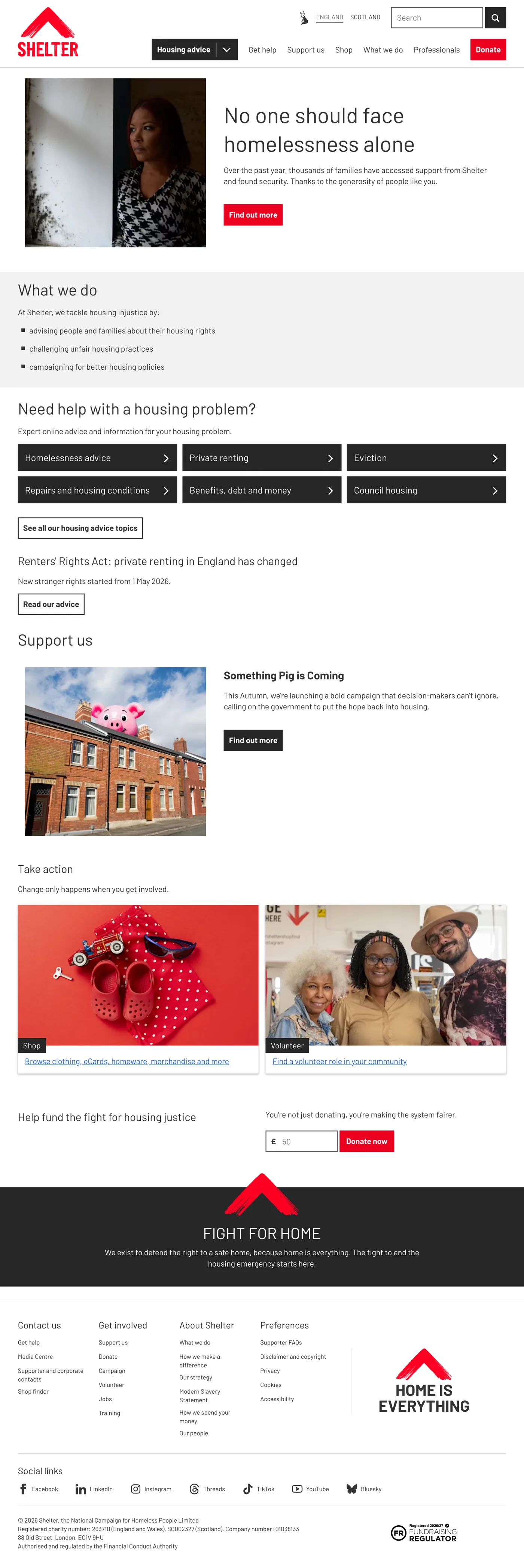

The homepage in 2026, on desktop and on a phone. Scroll inside the frames to see the full page. It still uses the design system.